Top 7 Email Marketing Conversion Strategies to Boost Your Campaign Results
Email marketing conversion strategies are key to making your campaigns truly effective. Sure, email marketing is still one of the most reliable and personal tools out there for businesses.
But let’s be honest—just blasting out a bunch of emails won’t cut it anymore. To get real results, you’ve got to use smart strategies that help your emails stand out. These are the secret ingredients that separate campaigns that convert from those that fall short.
Now, why are email marketing conversion strategies so important? Well, think of it this way: conversions are the end goal of every campaign, whether you’re trying to get users to make a purchase, sign up for a webinar, or even just engage with your content.
Without the right strategies, your emails might end up unopened, unread, or even worse—deleted. That’s why mastering these tactics is crucial to your campaign’s success.
So, if you’re ready to skyrocket your email conversions, you’re in the right place. In this guide, we’ll explore seven powerful email marketing conversion strategies that can help take your campaigns to the next level.
From personalisation techniques to optimising your email list, each strategy is designed to boost engagement and, ultimately, conversions.
Before we dive in, don’t forget—if you’re looking for expert help in managing your email campaigns or optimising your data, RD Marketing offers services that can help.
Whether it’s providing top-notch B2B Data or Email Marketing Management Services, we’ve got you covered. Keep reading, and we’ll show you how you can start seeing results immediately.
Table of contents:
Strategy 1: Personalisation for a Unique Customer Experience
One of the most effective email marketing conversion strategies out there is personalisation. Think about it—when you open an email and it’s tailored specifically to you, it feels like the brand really understands what you want.
So, how does personalisation work? It all starts with segmentation. By dividing your email list based on factors like user behavior, purchase history, demographics, or even browsing activity, you can create hyper-targeted campaigns. Let’s break it down:
- User Behavior: Segmenting based on actions like past purchases, downloads, or interactions with previous emails.
- Preferences: Categorise your audience based on their specific interests or the type of content they engage with.
- Demographics: Group your contacts by age, gender, location, or job title to send relevant offers or updates.
Another example could be sending location-specific offers based on where the recipient is based. For instance, a retail store can send special promotions only to customers who live within driving distance of one of their locations.
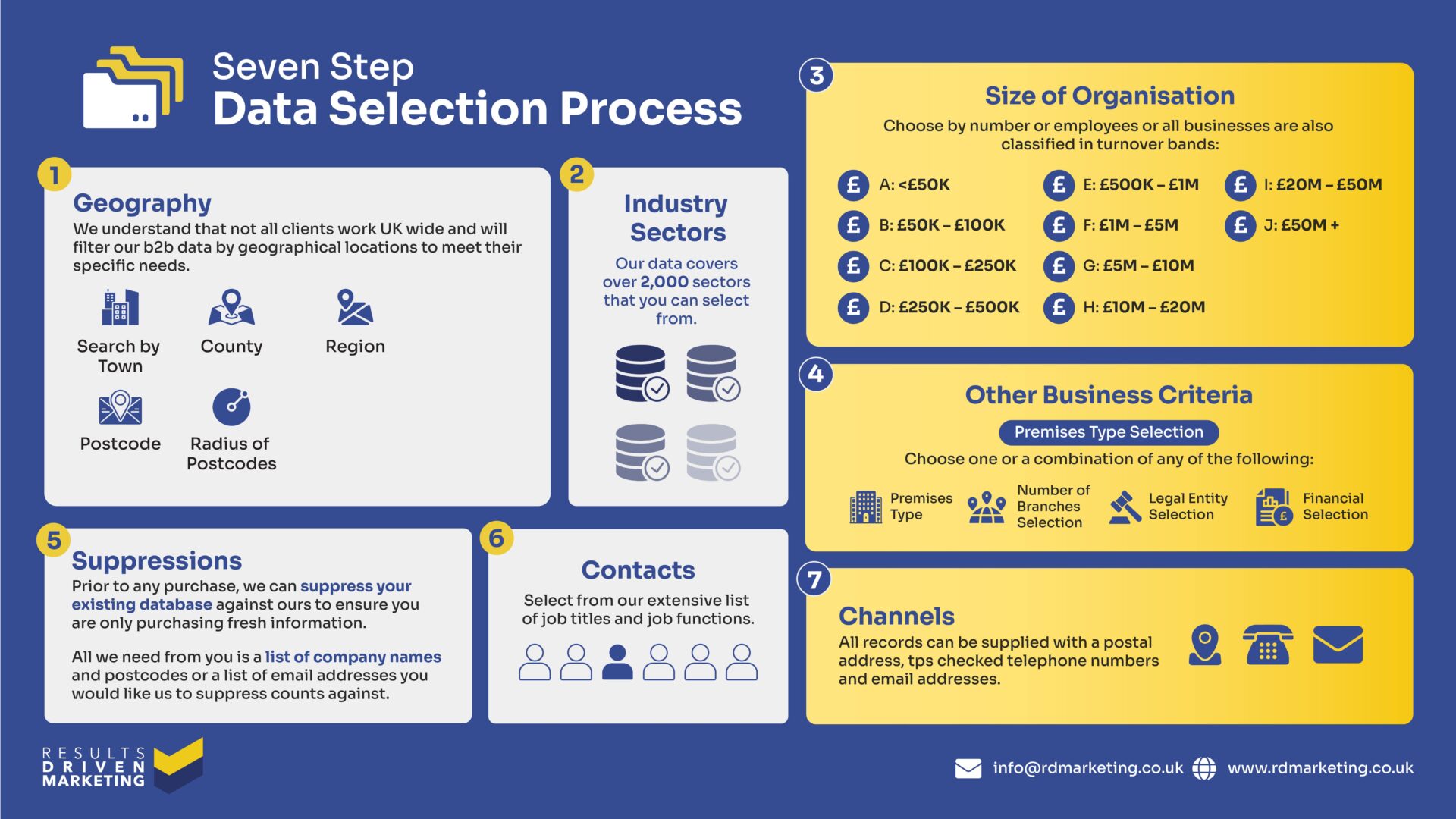
If you want to implement personalised campaigns that truly stand out, the key is having access to high-quality, segmented data. Need highly segmented email lists for personalised campaigns? Check out RD Marketing’s B2B Email Lists.
With the right data in hand, you’ll have everything you need to create a unique experience for each customer, driving engagement and, of course, boosting those conversion rates.
Strategy 2: Crafting Compelling Subject Lines and Preheaders
When it comes to email marketing conversion strategies, one of the first things you need to get right is your subject line. It’s the very first thing your recipients see, and honestly, it can make or break your campaign.
A compelling subject line can be the difference between an email that gets opened and one that gets ignored or deleted.
In fact, studies show that 47% of email recipients decide whether or not to open an email based on the subject line alone. That’s why nailing this element is critical to improving open rates and, ultimately, your overall conversion rate.
So, how do you craft a subject line that grabs attention?
Here are a few tips:
- Curiosity-driven subject lines: Entice the reader to open the email by sparking their curiosity. For example, “You won’t believe what’s waiting for you inside…”
- Benefit-focused subject lines: Focus on what’s in it for the reader. Something like, “Unlock exclusive savings today” makes the benefit clear right from the start.
- Time-sensitive subject lines: Add urgency to encourage immediate action, like “24 hours left to claim your discount!”
Remember, shorter is better. Ideally, your subject line should be around 40-50 characters to ensure it displays correctly on mobile devices, which account for a large portion of email opens these days. That brings us to another important piece of the puzzle—the preheader.
Preheaders are like a sneak peek at what’s inside the email. They appear just below the subject line in most inboxes and provide a little extra nudge to get someone to open the email.
A well-written preheader should complement your subject line and give more context. For instance, if your subject line says, “Don’t miss out on our big sale,” your preheader could say, “Limited time only – shop now and save 20%.”
Strategy 3: Clear and Compelling Calls to Action (CTAs)
A strong call to action (CTA) is absolutely essential in guiding your readers towards taking that final step—whether it’s making a purchase, signing up for a newsletter, or downloading an eBook.
So, how can you create CTAs that convert?
Here are a few key pointers:
Keep it Actionable: Your CTA should be direct and tell the reader exactly what to do. Instead of vague phrases like “Click Here,” go for actionable ones like:
“Buy Now”
“Get Started”
“Download the Guide”
“Claim Your Offer”
Button Design: CTAs are often placed on buttons, and button design can have a huge impact on whether people click. Use contrasting colors to make your CTA button stand out from the rest of the email. The button should be eye-catching, but still fit within your email’s overall design aesthetic.
Strategic Placement: The placement of your CTA can also influence conversions. Typically, it’s a good idea to include your CTA near the top of the email (above the fold) so recipients see it right away.
If your email is longer, don’t be afraid to include multiple CTAs throughout, especially after key pieces of information.
Urgency and FOMO: People respond to urgency, so incorporating time-sensitive language in your CTA can give them that extra nudge to act now. For example, “Limited Time Offer – Buy Now” or “Only a Few Spots Left – Register Today” can create a sense of urgency and encourage conversions.
Our team can help you design CTA-driven emails that are not only visually appealing but also optimised for conversions. Need help refining your CTAs? Our Email Marketing Management Services are designed to ensure every element of your email works towards driving results.
Strategy 4: Mobile Optimisation for Greater Reach
In today’s digital world, mobile devices are everywhere. A massive portion of email opens happen on mobile devices, which means optimising your emails for mobile is no longer optional—it’s absolutely essential.
So, how do you optimise your emails for mobile users?
Responsive Design: One of the most effective ways to ensure your emails look great on all devices is by using responsive email templates.
These templates automatically adjust the layout and content based on the screen size, whether it’s a smartphone, tablet, or desktop. This way, no matter what device your audience is using, they’ll have a smooth experience.
Loading Times: Slow-loading emails are a major turnoff for mobile users. To optimise for mobile, make sure your emails load quickly by keeping image file sizes small, minimising code, and avoiding large attachments. The faster your email loads, the less likely it is that the recipient will lose interest before they even see your content.
By optimising your emails for mobile, you’re not just improving user experience—you’re making it easier for your audience to take action, whether that’s clicking through to your website or making a purchase.
Need to target mobile-first businesses? Explore RD Marketing’s mobile-optimised data solutions to ensure you’re reaching the right audience with the perfect message, every time.


